web analytics

Archives for September 2014

Spring 2015 Color Palette No. 96

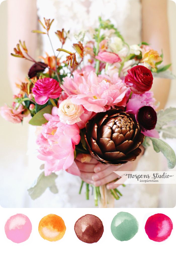
It’s here! The PANTONE Spring 2015 Color Report. Fresh, retro and fun!

Spring 2015 Color Report | www.mospensstudio.com

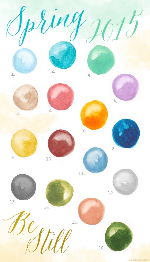
A lovely cool, calm collection of softer hues were chosen by the experts at PANTONE. Pale pastels and beautiful neutrals giving a nod to retro colors. Tropical colors for warmer spring weather are perfect. Escape the hustle and bustle from the busyness of everyday life with this collection of Spring colors. Subtle warm tones inject calmness.

Disconnect. Breathe. Be Still.

1. PANTONE 14-4313 Aquamarine
2. PANTONE 16-4725 Scuba Blue
3. PANTONE 14-5714 Lucite Green
4. PANTONE 16-3310 Lavender Herb
5. PANTONE 14-1213 Toasted Almond
6. PANTONE 16-1720 Strawberry Ice
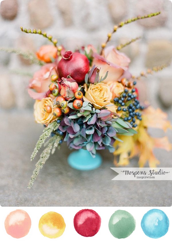
7. PANTONE 15-1247 Tangerine
8. PANTONE 19-4052 Classic Blue
9. PANTONE 13-0720 Custard
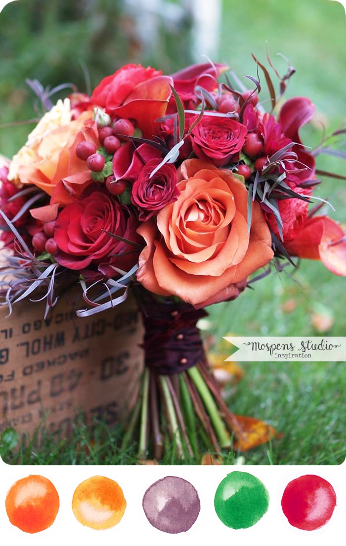
10. PANTONE 18-1438 Marsala
11. PANTONE 16-4120 Dusk Blue
12. PANTONE 14-4102 Glacier Gray
13. PANTONE 17-4014 Titanium
14. PANTONE 18-0538 Woodbine
15. PANTONE 16-1328 Sandstone
16. PANTONE 18-0135 Treetop

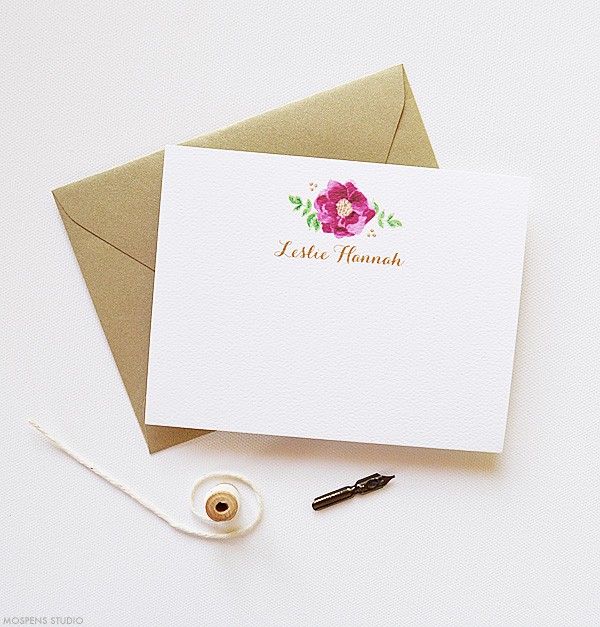
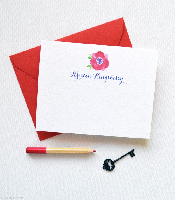
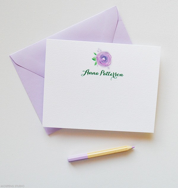
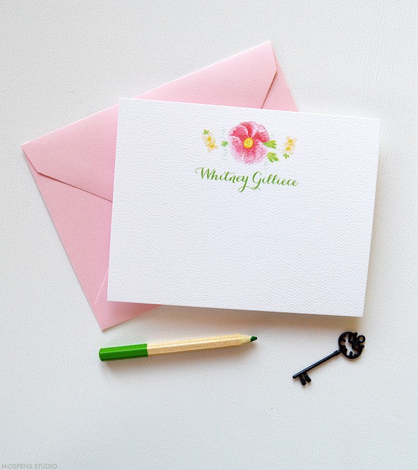
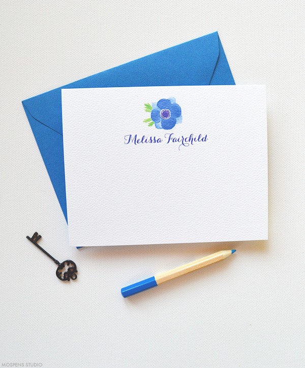
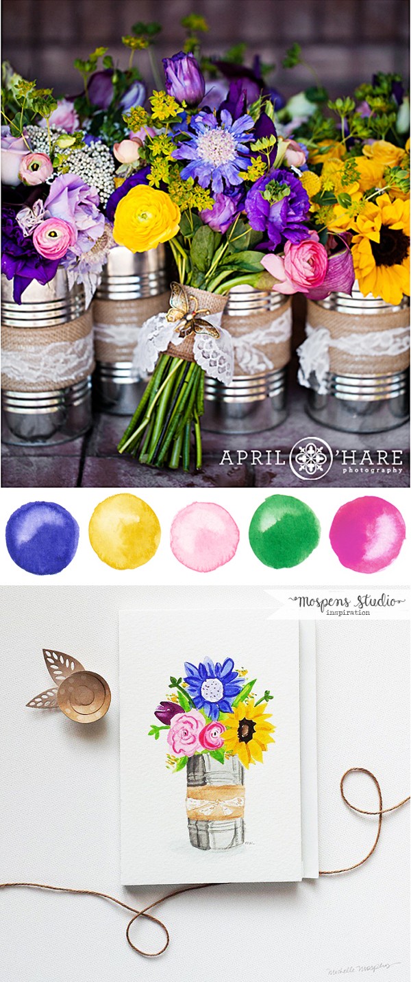
At Mospens Studio, we are happy to incorporate the freshest hues into your custom invitations and stationery! After you order, just tell us the colors you are using and we will pair them together perfectly just for you.

Alluring Autumn : Color Palette No. 95

Fall wedding theme color inspiration | www.mospensstudio.com

It’s that time of year… Fall leaves are changing their brilliant hues. I adore fall and love this classic autumn themed color palette. Rich red, orange, green, deep mauve taupe (I love this color!) and light yellow orange.

This is the perfect fall wedding bouquet.

Wedding flowers by Alluring Blooms.

Soft Fall Hues : Color Palette No. 94

Fall wedding color inspiration and ideas | www.mospensstudio.com

I’m in love! This lovely color palette of soft fall hues is perfect for a fall wedding, event or your home decor. When you think of fall you think of all of the brilliant autumn colors, muted fall tones are just beautiful.

The fresh blue and red pops with the soft peach, golden yellow and background of cool sage green colors.

Sources: Photo is by Julie Cate and fresh floral design by Bareroot Flora.

Personality Infused: 5 New Personalized Stationery Notes

Giving thanks and receiving a thoughtful note feels good. Make sure your personalized stationery notes match your personality. My five new note cards will help you do just that.

Personalized Thank You Notes | www.mospensstudio.com

Red Personalized Thank You Notes | www.mospensstudio.com

Purple Personalized Thank You Notes | www.mospensstudio.com

Pink Personalized Thank You Notes | www.mospensstudio.com

Blue Personalized Thank You Notes | www.mospensstudio.com

1. Sweet & Golden – Sangria and gold personalized stationery notes with watercolor illustration. Our felt stock has great texture and mimics watercolor cardstock.

2. Sweet Anemone – Bold red anemone illustrated in watercolor (my favorite) add punch to your note! Red envelopes to match of course.

3. Lovely Lilac – Light purple watercolor flower is super sweet and perfect for a thank you.

4. Flirty Floral – If you love pink, you will adore this delicate pink flower notes.

5. Bold & Beautiful – A brilliant watercolor blue anemone flower with matching envelopes are perfect for your personal stationery or for a gift!

Q. When do I mail our my thank you notes? A. The day you receive a gift or within a week of the occasion that is prompting you to give thanks or write a sweet note.

Custom personalized stationery notes are made to order and are customizable to match your personality. Contact me today to get started.

Summer Wedding : Color Palette No. 93

Bright summer wedding colors | www.mospensstudio.com

Hellooo! When I saw this amazingly bright bouquet of flowers photo by April O’Hare Photography, I dropped everything and painted what I saw. What a gorgeous combination of bright colors. I thought, they are just perfect for a summer wedding.

Bundled in a vintage silver tin can wrapped with burlap and lace, I fell in love. The splash of plum and sunflowers make this wedding bouquet pop.

I think I need to create three of these as centerpieces and add them to my kitchen! So beautiful and super sweet.

Fabulous Fall : Color Inspiration

Gorgeous late summer / fall wedding theme color idea | www.mospensstudio.com

Today, I am featuring the perfect color combo with late summer and fall hues. Fabulous for a late summer or fall wedding. The pink, bronze, and hot red pink caught my artistic eye. Splashes of light orange paired with light sage seemed perfect.

This GORGEOUS photo by Kay English Photography was just too stunning NOT to share. See even more inspiration on Style Me Pretty.

Metallics paired with rich colors create a fresh wedding color palette. I am loving this fresh BRONZE metallic with bright hues. This combination is fresh and completely modern. SWOON! I am beyond inspired to create custom wedding invitations to match!